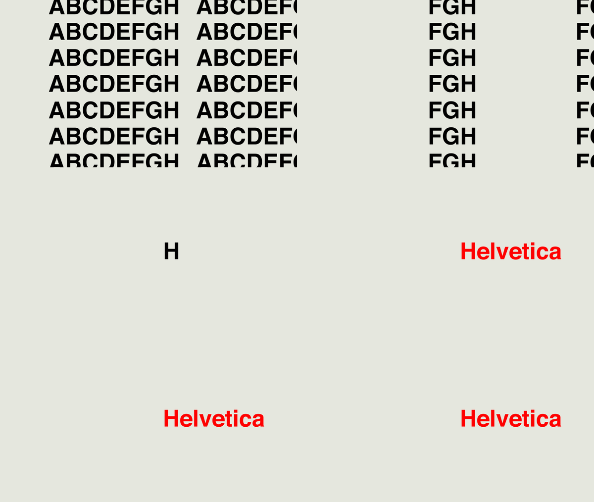
Helvetica Title Sequence
While brainstorming films that I could creatively design and animate, my mind lead to a documentary that almost every graphic designer has seen at least once in their lifetime – Helvetica.
swiss, of course
Many Swiss designers helped popularize Helvetica during the peak of the International Typographic Style, a style that focused on cleanness, readability, and objectivity. Today, we associate with this style the idea of grids, flushed left text, limited color palettes and sans-serif fonts like Akzidenz Grotesk, Univers, and Helvetica. I reiterated some of these ideas into the title sequence.
scenes breakdown
Many points of the film lead up to the idea of obsession and over-consumption of the typeface Helvetica in our visual culture. We see it on vehicles, signage, clothing, mailboxes, packaging, publications… You get the idea. I figured that the title sequence for this film can give insight into that aspect as well as acknowledging all of the featured speakers.
Using screenshots from the documentary and colors from several sources, I designed the scenes for the title sequence in a storyboard. Top it off with a sexy jingle, and you’ve got a title sequence for Helvetica.


