The land of tulips
During the summer of 2018, I jumped on a plane and headed east to study Visual Language Design in the calming lands of Holland.
The purpose of this study abroad program was to cover theories and practices of visual language systems in the Netherlands. For two weeks, our group visited museums, community organizations and design studios for visual language research.
The System
As a part of the study abroad program, we studied the signs developed for Isotype directed by Otto Neurath and created by Gerd Arntz. The depicted images ranged from industrial, political, demographic and economic areas all the while maintaining a consistent design system.
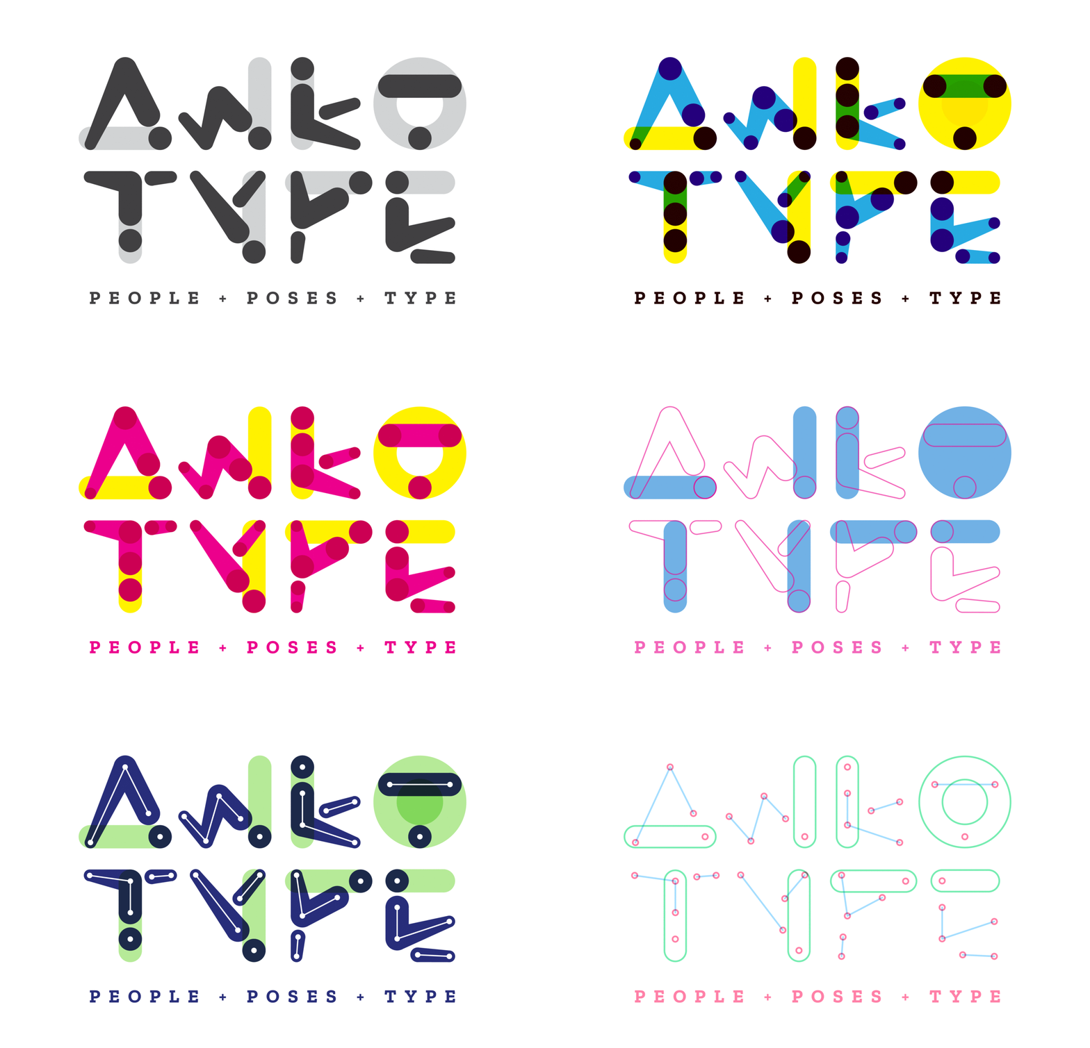
Adopting similar ideas of system-making, I chose to manipulate humanoid symbols to represent letters of the alphabet. In order for them to visually feel like family members, rules were created and applied to all of the letters (e.g., three joint sizes, specific angles, same head sizes, etc.).
The result: one funny-looking alphabet.
The creation
The system allowed for a wide array of variations in color and stroke treatment––making the letters flexible for many combinations. I experimented from fills to overlays, dots to outlines. I ended up with many childish (aka, fun) sets of colored letters. Bright and playful colors seemed to fit the unconventional aspects of these weird figures.
The play
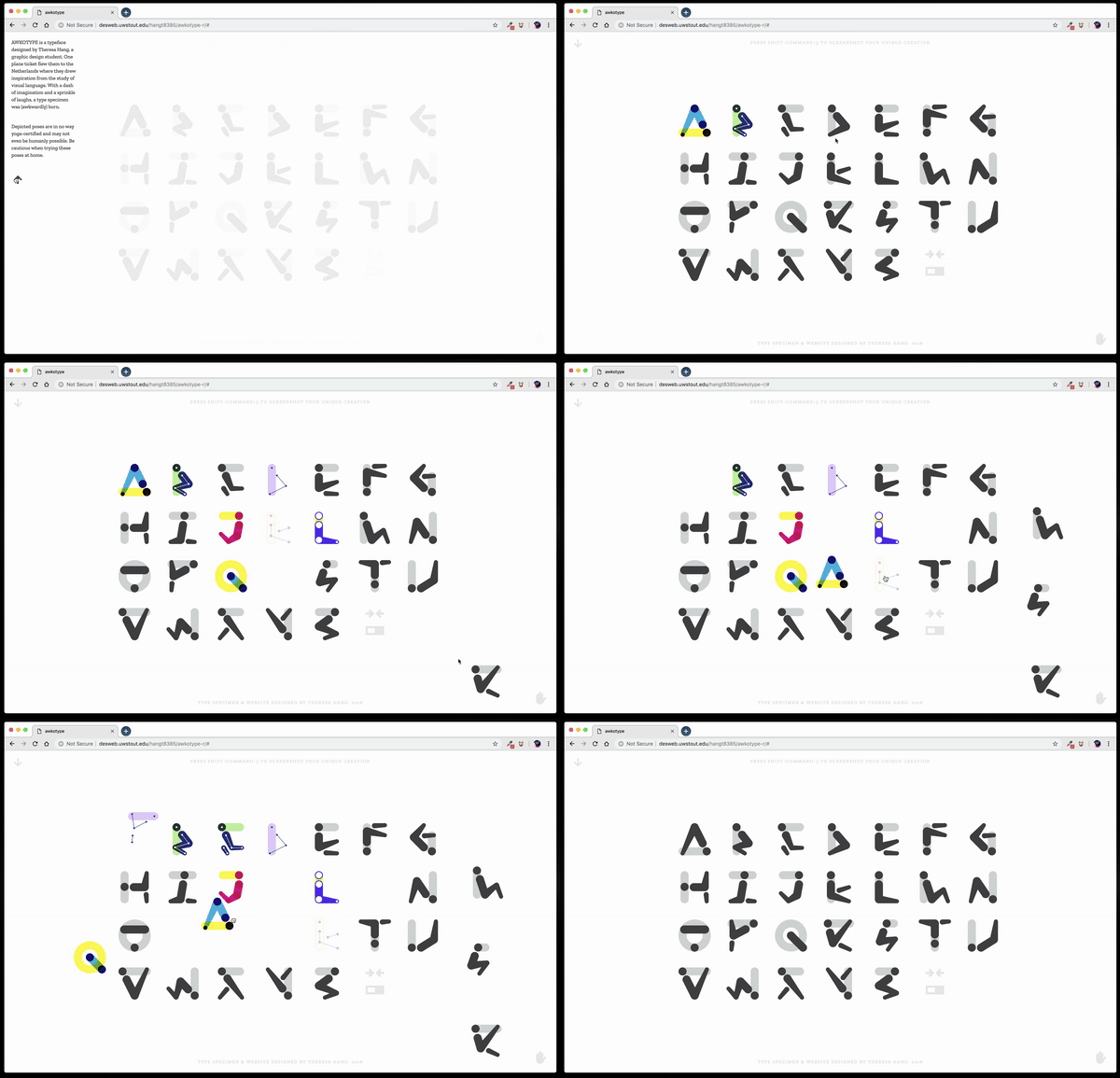
In the final steps of Awkotype, I wanted to produce a site for people to experience this colorful, fun, symbol-inspired language.
Visitors are encouraged to move and change the letters to create words or drawings. The entire site serves as their blank canvas while including options to reset the colors and/or return the letters to their original position.


